|
Game Unit: To the Top
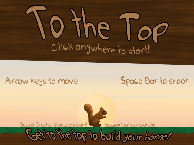
The game I created with a friend is a platform game in which you control a squirrel with the goal to get to the top of the tree in order to build a home. To start making the game, I had to make sprites which would become objects in my game as well as make the art for the background of the game. My favorite part of creating this game was coding it. It was very satisfying when I would hit a problem in the code and be able to fix it. If I had more time I would probably create another level for the game. Overall, I enjoyed this project a lot because in the end the product seemed very professionally made. Phenakistoscope
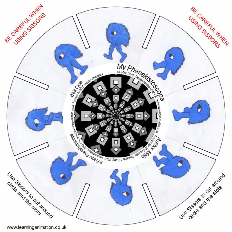
A phenakistoscope is an early devise using the persistence of vision to create the illusion of the pictures moving, creates 'animation'. A loop is an action in animation done over and over again. An example of a loop is the walk cycle. I have to say that the most interesting early animation tool to me is the phenakistoscope because it makes a series of photos move around in a circle to create the illusion of movement, which I find very interesting. I found making this phenakistoscope some what difficult because it required drawing the same image over again, as if copying, and only having the legs be inconsistent. This was difficult to do because when I had drawn the creature again it looked different from the first. In the end, the creature seemed to be changing shape as well as walking. Color Theory Project
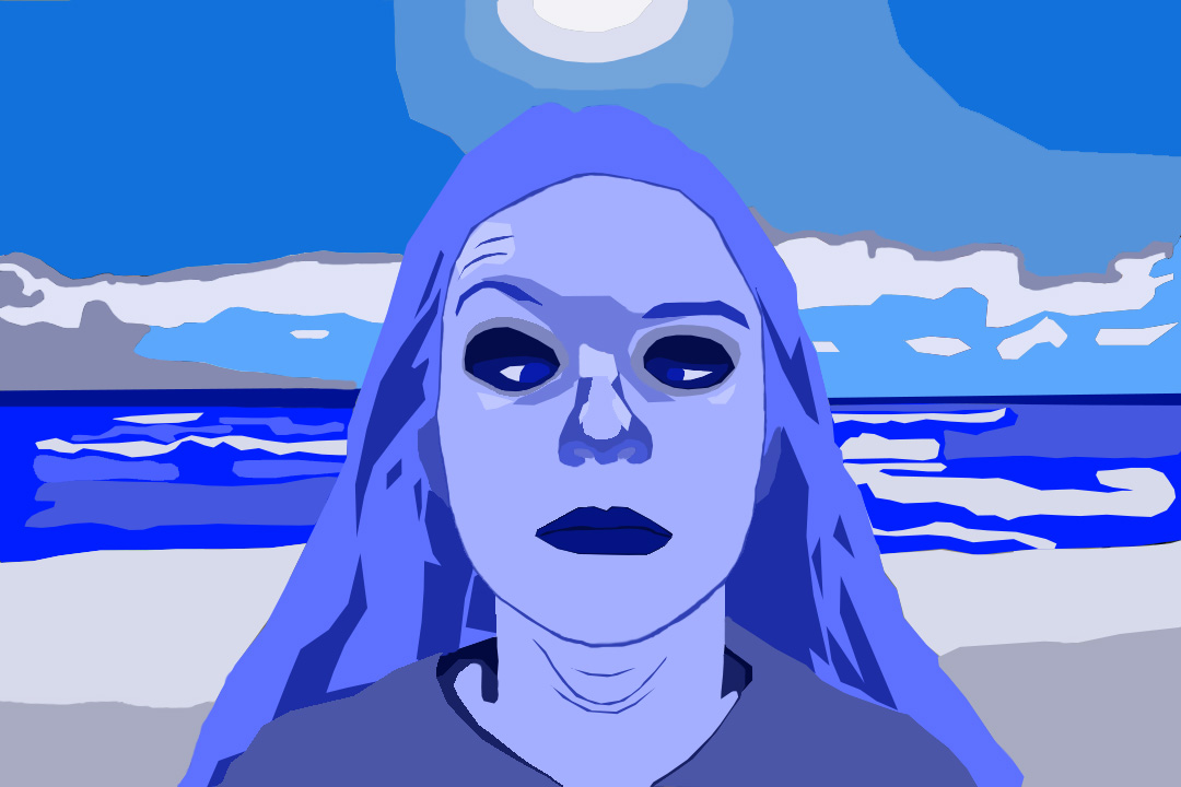
I used monochromatic color theory to make this project. I think it works well because it shows nice shadowing. I also think it works well because it is simple but also shows the shadows, highlights and variety of color. Photo Unit Project
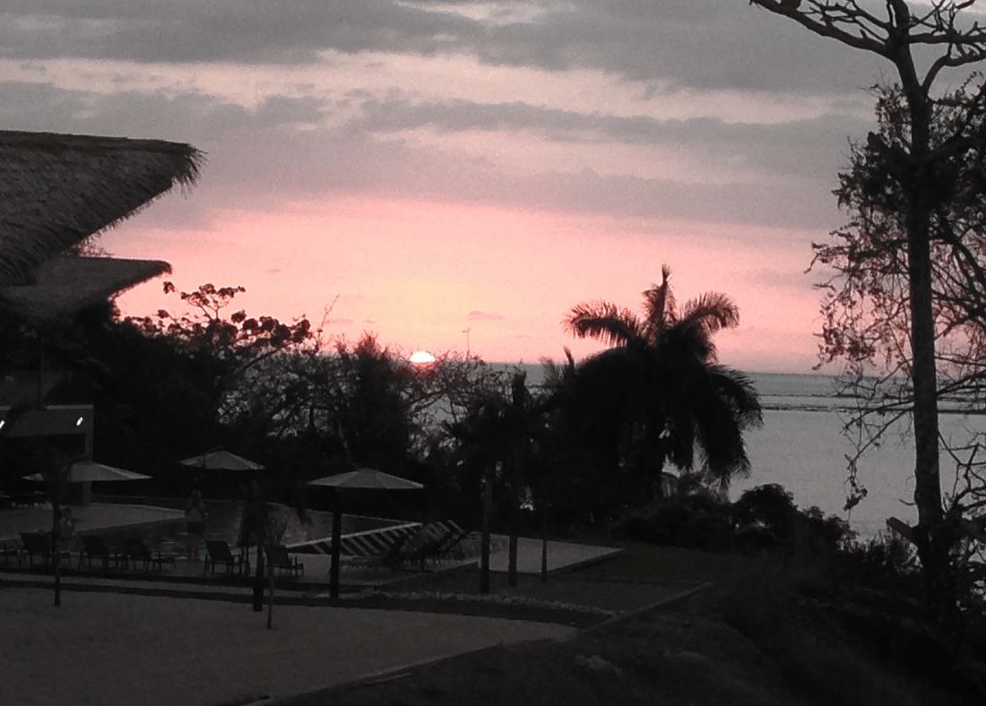
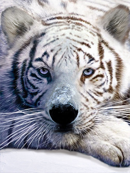
My favorite photos are my two choice photos, the first being a silhouette and the second a double exposure, both with added effect. I like the silhouette because it is natural and the color the sun emits looks nice with the rest of the picture. I like the double exposure because it is mysterious looking and has a interesting combination of separate pictures. Critter Montage! The Polar Tiger.
The two creatures I used to create this montage are the polar bear and the white tiger. The tools in photoshop that worked well were the eraser and the clone tool. The element the most strong, in my opinion, in this project is texture. The furs go well together and you can see the texture of the fur well. The principle that is most strong, in my opinion, is balance. The colors and lines do not feel offset in this montage. The reason these animals worked well together is because the furs of them are similar and so are the colors. Tessellation Tutorial
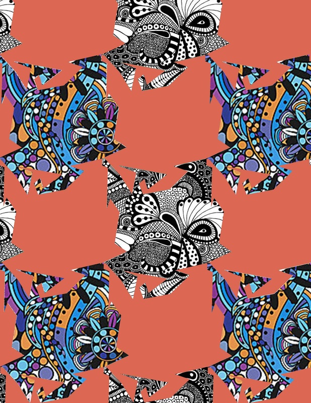
The element I used the strongest in this tessellation is color because of the background and the colored pattern. The strongest principle I used is probably pattern because the shape is repeated and the patterns alternate in a art. I think making a tessellation on the computer is easier because it is easier to make it precise and to move around the parts of the art. Overall the tessellation is an easy concept and fun thing to make. The artist that is famous for making these is M.C. Escher. |
|
|
Fontbot Project
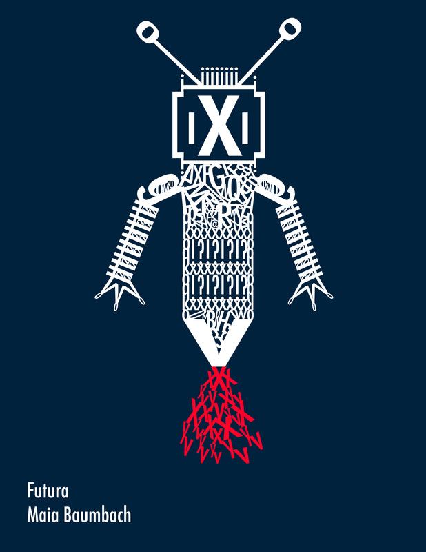
The font I used for this fontbot was Futura. This font is sans serif. I feel like in some ways this font does match this fontbot and in some ways it does not. It does match because it looks future-like because of the fact it is a bot. But, I feel like it looks like a bee which does not feel future-like. I did like the process of making this fontbot in PS because after you learned the process it was simple and easy. Of course the process took a long time but I can't think of a different way that I could of made this fontbot easier and faster. I think this fontbot would be a pretty cool guy. I think he'd have a ton of friends. I think he would be that person who has a lot of weird interests that no one else has. |
|
|
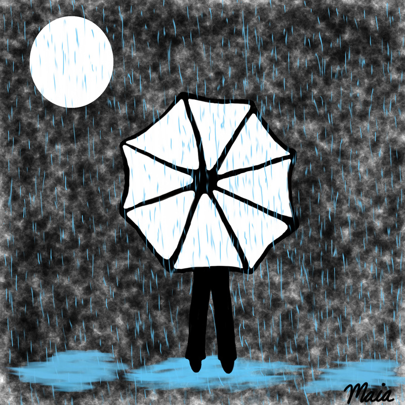
Square 1 Art Project
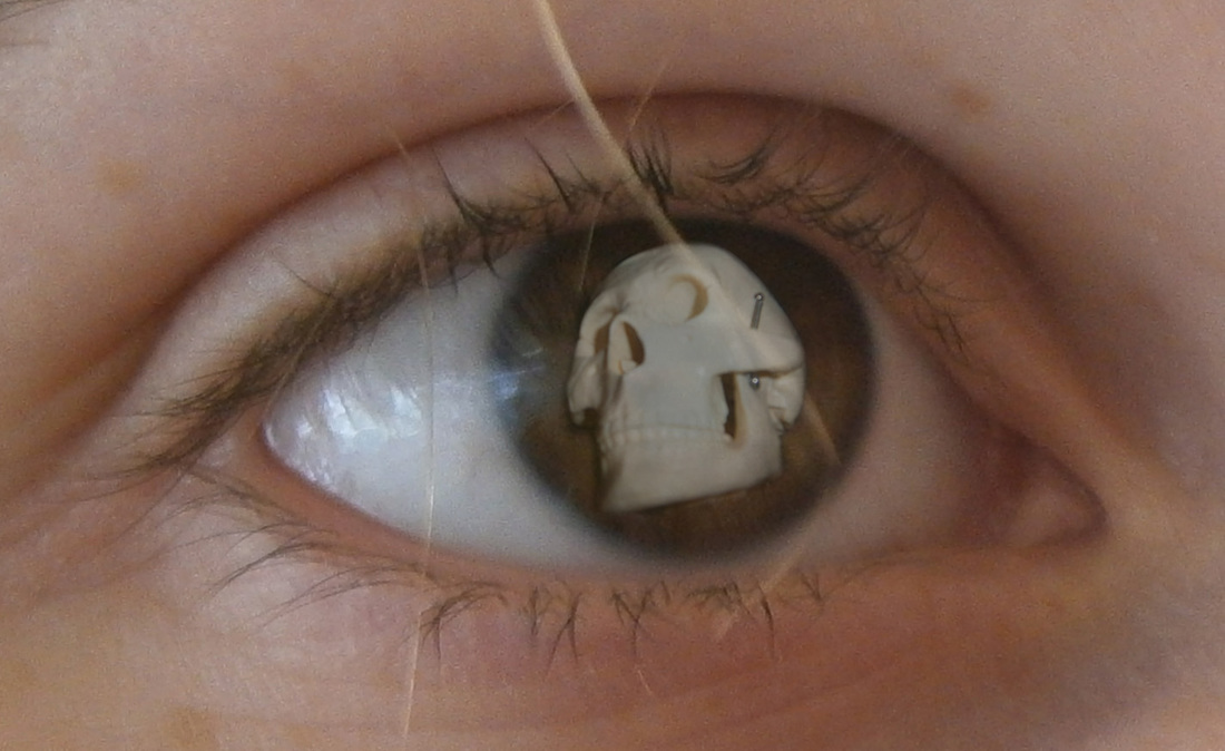
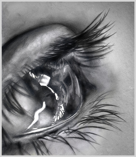
The process to make this was to do the different parts of the art separately. I drew the umbrella and person and used different brushes for the background and the puddles. The rain I smudged to look better. The strongest element I used was color because the contrasts and how it stands out. The strongest principle I used was emphasis because the white stands out against the black. I liked the tablet because it was easier to draw with and I didn't have to move the cursor as much as I would with the mouse. I did high contrast, the white black and blue work together but also have contrast. This is a pencil drawing of an eye by 'Dr.Odd'. I really like this drawing because I take away from it. This picture compels me to look at it and therefore I feel emotion. I fell calm. I like the way the artist made this. It is very realistic and beautiful. I find the light glare very well done and nice. The shading the artist used is brilliant. Most of all, I like this artist because of the way he draws with just a pencil.
Here is the artist's site where you can more wonderful art. |
|
